
The right color choice goes unnoticed while the wrong choice always stops users in their tracks. Color can be a powerful tool for designing your website. When combined with the perfect font selection, your design becomes unstoppable.
That being said, it’s not enough to spin the color wheel and go with whatever you stumble upon. You need to be careful when planning your color and font selection. Luckily, you don’t need to enroll in any color theory or typography courses to get this down. In this guide, we’ll walk you through the best way to choose the right colors and fonts for your website.
Why Do Colors and Fonts Matter?
First, you might be asking yourself what the big deal is. After all, color and font selection are just one of the many elements on the page. In reality, color is crucial for the success of your overall web design. It evokes an emotional response from your audience.
Similarly, your fonts also send a message to your users. A serif font will give off a classic, professional appearance while a script font might hint at whimsy and playfulness.
Today, 48% of people cited a website’s design as the primary factor when deciding if a business is credible. With a statistic like that, it pays to take your colors and font seriously. Let’s explore the step-by-step process for making sure you’ve chosen the best possible color and font elements for your website.
Step 1. Dominant Color
The first color you need to pick is your dominant color. Your dominant color is your brand color. For example, Coca-Cola’s brand color is red, McDonald’s brand color is yellow, and Starbucks’s brand color is green.
Colors are tied to our psychology. Here’s a quick introduction to the meanings behind your favorite colors:
- Red: Passion, energy, excitement
- Orange: Creativity, friendliness, enthusiasm
- Yellow: Optimism, cheer
- Green: Health, calm, nature
- Blue: Trust, stability, peace
- Purple: Royalty, success, wisdom
- Pink: Feminine, romance
- Black: Power, luxury, elegance
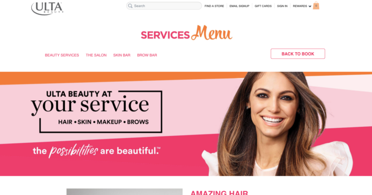
Can you see how you could use this psychology to reach your audience? For instance, if you have a health brand, choosing green as your dominant color could help you communicate this quickly. See how Ulta, a beauty brand, uses a subtle pink shade as their dominant color to attract women.
Step 2. Accent Colors
Next, it’s time to choose your accent colors. Your accent color will be used to highlight secondary information on your page that you want to stand out, like links, buttons, and so on. Understanding which colors work well together isn’t always easy, especially if you don’t have design experience already.
A great way to find colors that work well together is with a tool like Colour Lovers. With this platform, you can see user-generated and expert-selected color pallets, and look for one that speaks to your brand.

Melyssa Griffin, a well-known blogger, uses light blue as an accent color to help balance the excitement of the yellow, her dominant color. See how well they work together when drawing the user’s attention to her logo and call to action.
Step 3. Background Color
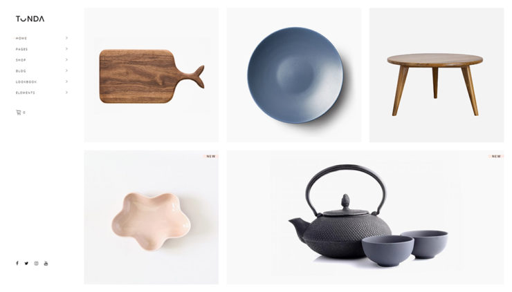
Our last color choice is the background. The color you choose as your background will depend on your website’s purpose. If you run an online store or plan to have a lot of visual elements, most of the time it makes sense just to go with white.
With a white background, the focus is on the products themselves. See how with Tonda WordPress Theme, the white background allows the products to pop on the page.
On the other hand, a corporate or business website might have a colored background. This is because the focus isn’t on the products or services, but on telling the brand’s story. The background color has a chance to elevate the narrative and make the experience more memorable.
Again, see how this Hyperon theme uses darker colors in the background to emphasize an upscale, luxurious brand. The images still pop, but it’s more about the branding.

Step 4. Font Choice
It’s time to talk about fonts. Once again, it’s not as simple as choosing the font you like the best. You need to consider your audience, your brand story, as well as readability.
The main types of fonts you’ll encounter are serif, script, and geometric. Some are modern, while others appear to be written by hand. All of these can be used to tell your story, whether you’re a modern business that uses a bold font or you’re a classic company with a traditional serif.
Below, Forbes, an entrepreneur publication, uses a serif font to show it’s professionalism as a publication. It looks upscale, modern, and easy to read.
When choosing your font, pay particular attention to readability. Your font serves no purpose if it can’t easily be read by all screen sizes. Similarly, make sure your font loads quickly on the page. A startling 39% of users will stop engaging with a website that loads too slowly. Function needs to come first.
Step 5. Pairing Fonts
Finally, let’s touch upon how to best pair fonts. You most likely will choose two fonts for your website. One styled font for your bold headlines, and another font for the bulk of your content. In some cases, you might have a third for subheadings or special elements.
When pairing fonts, try to stick to the same “theme.” For instance, pairing modern fonts with other modern fonts works well. A font pairing guide will help with this process.
The only exception to this is with script fonts. When using a script font for headings, you likely need a different font to balance it out. Script fonts are notoriously hard to read, especially in smaller print, so pairing it with another font can add balance. Foxtail coffee did a great job balancing a script font with a modern geometric font on their homepage below.
Design Your Website Confidently
Now that you have a new perspective about color and font selection, you’re ready to approach the web design process with confidence. There’s a lot more to color and fonts than meets the eye. The more you know about the psychology behind these elements, the better equipped you’ll be to attract your ideal audience.
How do your color selection and font choice stack up? It might be time for a few adjustments based on these steps above. With so much competition, there’s no time to waste.

@nislija
Latest posts by Ivan Muljevski (see all)
- 6 Best Email Capture Plugins in 2022 (Free and Paid) - November 22, 2021
- CXL Institute Courses Review 2022 - November 17, 2021
- Best Webinar Platforms to Teach and Sell in 2022 - October 31, 2021
Selecting the right colors and fonts for your website is crucial for user engagement. Thoughtful choices can enhance your design’s impact. Avoid haphazard decisions; instead, consider your brand, target audience, and message. It doesn’t require formal training—just a strategic approach to create a visually appealing and effective website.https://savvytipsguru.com/is-a-game-design-degree-worth-it/