WordPress 3.6 has arrived. It comes with a lot of new features, updates, bug and security fixes. The focus is on… you guessed it – blogging, but also user interface and usability.
 With 2013 theme you get a single column layout by default. Your primary sidebars and widgets are in footer, where they should be, not interfering with the main topic of a page, while right sidebar is still an option.
Improvements
WordPress has always been quick to improve on stability and security bugs but there were never serious UI and functionality improvements for those who use WordPress solely for writing.
A real auto-save feature
It happens to me all the time. I forget to save my drafts or I tend to close tabs unintentionally when in that “I’m certain I can write a post in under 30 minutes” frenzy.
Autosave and post locking features have a job of never losing your posts. This is done by leveraging browser-level storage in modern browsers for situations where users lose their internet connections or their browsers crash. Your edits are stored locally and synced back to WordPress the next time it’s possible.
Post Locking is for pages that are currently being edited, so you get the option to “take over” or “go back”.
Revisions
The user interface for comparing post revisions has been significantly updated. It includes a bar that allows the user to move forward or back in revisions and colored text to indicate content that has been added or removed. This is something a lot of folks wished for and I’m excited just by writing about it.
Menus
Creating custom menus is now a lot easier and with a cleaner interface. You’ll see new checkboxes to select where the menu will be displayed in the theme, accordion styling to menu item and a new help text and keyboard accessibility for rearranging menu items.
With every release there’s always been a new default WordPress theme bundled with it and this time it’s a special one.
2013 WordPress theme
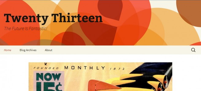
The 2013 is nothing like you’ve seen so far. Unlike the previous default themes, it has a strong presence and you’ll get that warm, fuzzy feeling by looking at it. Click on the image to see the demo.
I’ve always used WordPress default themes as starter themes. They’re nicely coded, come with great support and updates and I’d tweak them to my liking in a matter of hours. I’m not saying that 2013 theme doesn’t need some polishing, but you could easily use it as is, without rewriting a single line of code or CSS.
Responsive and Retina Ready
Twenty Thirteen features responsive layout, a standard by today’s terms. It’s intended to be viewed on any size device from smartphones to tablets. It uses Genericons, which we intend to use in our themes as well. This ensures that everything looks sharp, even on retina displays.
Typography
2013 focuses on readability and legibility. It uses Source Sans Pro and Bitter for body and header fonts with an addition of a symbol-font called Genericons, mentioned above.
Post Formats
Post formats is something we’re familiar with, but haven’t really taken the time to embrace. WordPress 3.6 intended to rectify this by standardizing post formats and how they appear in your WordPress dashboard, but they’ve extracted this feature out of WordPress 3.6 as a standalone plugin. It will appear in the WordPress.org plugin repository soon.
Each form is shown a bit differently than standard blog posts, including a background color and possibly different text treatment. You be the judge of its usefulness.
Widgets
The theme works and looks best in a single column layout without a sidebar and the place for your Primary Widget Area widgets is reserved in the footer. I’ve always thought that a single column layout is the way to go. Nothing to distract a user left only with a vertical scroll in control.
Although we’re infatuated by all things digital, I believe that analogue things are a true refreshment for and often missed by people online. Nothing else to think about, nothing else to look at, only what’s in front of you. As an SEO, I believe that the single column layout may increase your conversion rates, although I haven’t really taken the time to test this theory, in the end it all depends on the niche you’re in.
Don’t worry, you can still add a right sidebar if you want to by dragging your widgets in a Secondary Widget Area – Appears on posts and pages in the sidebar.
You should note that since 2013 uses full width layout on all pages, setting your custom background images and colors is not possible.
How to Install Beta Versions of WordPress
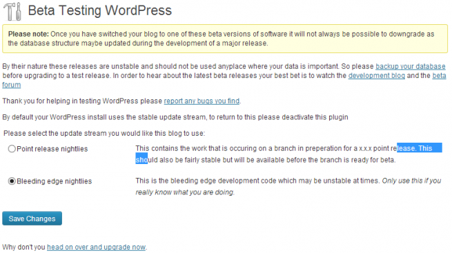
If WordPress 3.6 is yesterday’s news to you and you want want something fresh to play with, you can install beta versions. To do this, you need to first download and activate a plugin called WordPress Beta Tester.
Enable “Bleeding Edge Nightlies” if you wish to update to the latest beta iteration and that’s it, just hit that Update button in Dashboard > Updates.

Our developer, Slobodan, has done a review of the default 2013 default theme and it looks and feels stunning. It also works admirably, as we’ve yet to stumble upon a bug.
If you’re eager to try the latest WordPress flavor, I recommend you avoid testing on websites that you live of. With the rise of so many bloated WordPress themes, I guess some of them will not be compatible with the latest WordPress release.
You can showcase your custom WordPress 3.6 websites in the comments below and be sure to subscribe to our mailing list for more of the WordPress tips, tricks and reviews.
photocredit: http://wordpress.org, http://wpmu.org


Good review. I differ only on one point, in that I like sidebars. Desktops use widescreen monitors, and much of that is wasted in single column layout. If your post does not interest a visitor, he is likely to leave rather than scrolling all they way down to the end of your post to see what else you may have available. With a sidebar, at least the visitor may see another topic that motivates him to keep clicking. The point I think is to fill a widescreen monitor with what you might call distractions.
Furthermore, a bright white screen punishes the viewer, causing inflammation to the eyes. It is the same as looking directly into a light bulb.
I am looking forward to getting my hands on “twentythirteen” as a new and more advanced base.
I agree that single column layout is not for everybody and Twenty Thirteen developers acknowledge that, so people still have the option of sidebars.
As for the black font on white screen, you can always change the background color. Were you referring to bright white screen on our website?
Just a note, they decided not to include post-formats interface in the release. It was one of the best enhancements but anyways.
Why do you think it was one of the best enhancements? Do you use post formats often?
… and thanks for the heads-up.
Actually, they decided to move it out of the core and make it available as a plugin. Something like MP6. And as much as I loved the idea of post format core feature I’ve never seen anyone use it. I currently maintain ~300 sites and not a single one does it. Maybe it’s just a weird coincidence, but sample size is not small there.
In the long run, this decision to leave post format out of core might be one of better things to happen to WordPress. They saw Tumblr and thought it would be a good idea to copy what Tumblr does. If post formats were not pulled out of core this time, who knows which feature would be next, when improving what WordPress does probably is better way to go.
Thanks Dragan.
I cannot get sidebars on pages on 2013 – any ideas?
Martin
Hi Martin, it works fine for me, as long as you have some widgets in the correct sidebar area.
Slobodan,
Sample page: http://cheap-guest-houses-stlucia.co.za/ithala/
I see them now. There are over 250 pages so a sidebar menu based on major categories is useful. I used the ‘page menu’ plugin, put together a separate menu and chose it. Invisible. Do you have any suggestions for a ‘page’ or ‘category’ specific sidebar menu plugin??
Martin
So, it’s not a matter of sidebar not showing, but a certain widget being empty, right?
Could you explain what you mean by ‘page’ or ‘category’ specific sidebar menu plugin? Showing up only in certain pages/categories?
Finally found – after several unsuccessfu attempts – intelliwidget. I didn’t want a menu to be the same across all pages but this one seems to do the job. Of course there are no ‘category’ pages but this plugin can simply use the settings from another page that use the same sub-menu.
http://cheap-guest-houses-stlucia.co.za/cape-vidal/
shows a sub-menu for this bunch of related pages.
Thanks a lot!
Hello Dragan,
I love this new theme, I put it on my site and love it, but there is one thing I didn’t like, ***the comments**, when you reply to a comment you can’t tell which one is a reply and which is the original thread, I can see you change the comments layout, can you tell me how to do this? You can see my site here, I have over 25,000 comments and it’s a bit difficult to see where a comment begins and who replied to it.
http://papaesceptico.com/2010/09/la-solucion-homeopatica-al-sobrepeso-homeodimfit-con-chorros-de-evidencia/#comment-33163
Thanks a lot!!! :D
Hey,
The new theme looks awesome, apart from the comments style, I agree. There should be more indentation or some other visual effect. We’ll release a couple of child themes for Twenty Thirteen and I’m pretty sure we’ll address this issue.
For now, why don’t you enable Jetpack comments or some third party commenting system, like Disqus?
Thank you,
I like comments on my blog to be as open as possible, I have a lot anonymous people posting, and that is because I attack charlatans, among other things, I try jetpack but it didn’t work correctly, anyway, Thanks and Ill wait for the child themes
Other than the side bar option… is there a way to control the default one column width? Can it be broken in to two or four columns?
I don’t think it can. It’s just the way the theme is designed.