The modern smartphone is a standard around the globe, so it’s odd that so many websites still have weak mobile views. They use elements that won’t comfortable scale down, and some even rely on outdated Flash animations.
As a result, they drive mobile users away in droves — a huge problem when you consider that mobile browsing has become the dominant source of traffic for most niches.
In fact, it’s no longer enough to provide an adequate mobile experience. The bar has been raised by countless superb sites and UX designs, and the future belongs to mobile-first design. That means starting with the mobile view, then adapting it as needed.
You might think this can wait — that there’s no hurry to make the change — but there’s no time to waste. If you don’t shift to a mobile-first approach now, you’ll be left behind. Here’s why it’s so valuable, and why you need to take action today.
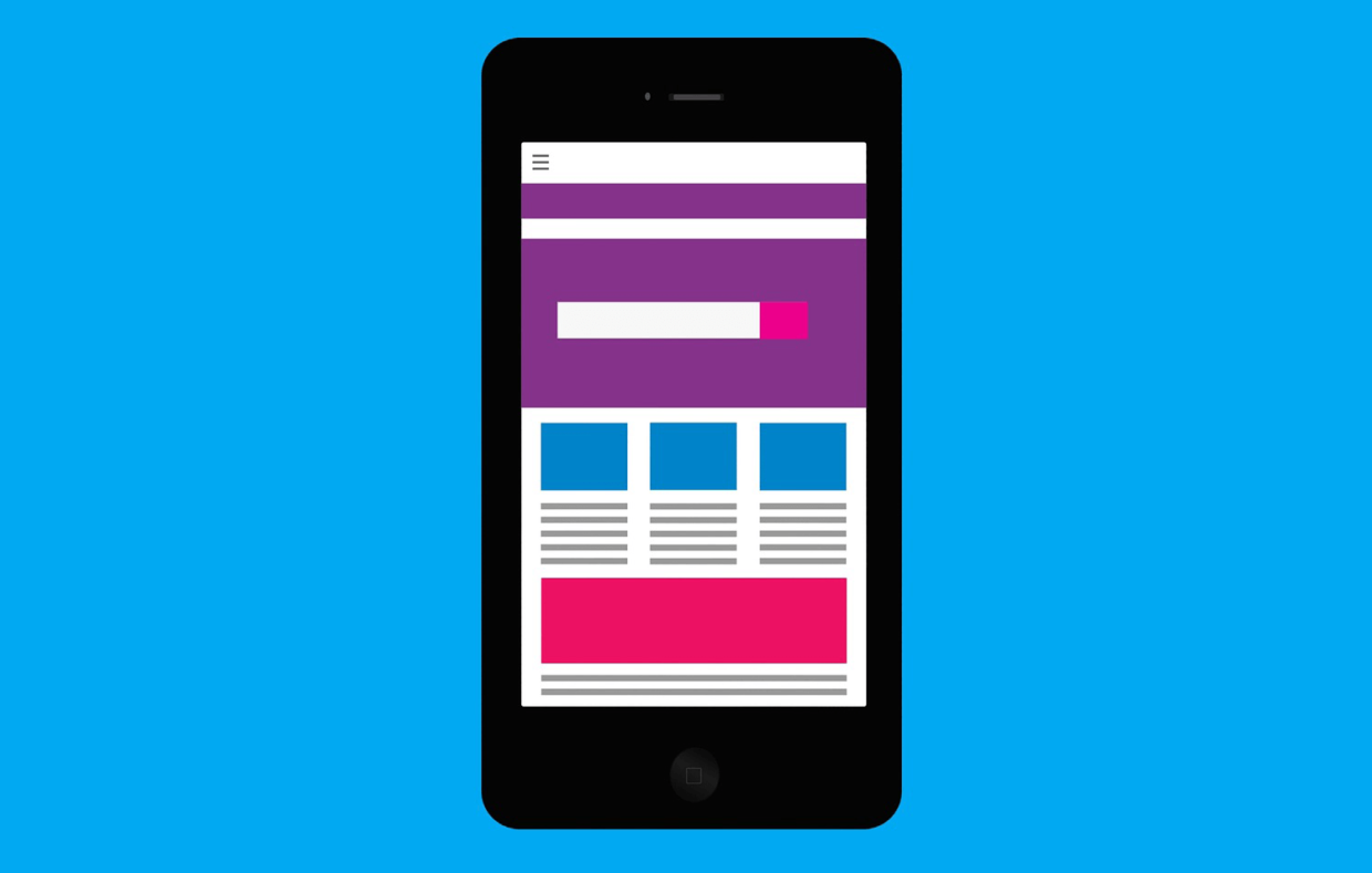
The Mobile Format is the Most Challenging
There’s no challenge in making a layout for a desktop view. It may have been tricky back when a 19″ screen with a 4:3 aspect ratio was high-end, but not now. Today, there’s plenty of space to work with, and widescreen displays larger than 24″ are standard. It’s probably harder to mess up a desktop layout than it is to get it right.
But designing a great mobile interface is different. You’re making something that must work smoothly on a 5″ screen with capacitive touch operation. That means cramming everything important into a small area without making things tough to read. It also means making every interactive part prominent enough to operate with the swipe of a finger.
So why should you do the mobile design first? Because that’s the hard part, and it’s tough to know how long it will take. If you start with a desktop design and get it done quickly, you might get a false impression of how much time you have.
Imagine messing around with aesthetics for a long while, only to discover at the last minute that the mobile version is so much harder. As it turns out, you miscalculated so much that you don’t have the time to get it done.
Following the basic principle of getting the hardest part done first, you should open with the mobile design. Once that’s done, expanding it to desktop size should be easy.
Mobile Designs Can Scale Up Automatically
While you can expand a mobile design to desktop size, that might not even be necessary. After all, a great mobile design can often scale to desktop size perfectly without any tweaks whatsoever. This is a huge timesaver.
The key is defining everything by page size and the type of browser being used. When the size changes, everything can shift to adapt to the available space. This includes the menu and other navigational elements.
Will taking this approach result in a wonderful desktop experience for someone using a high-end iMac? No, of course not — for that, you’ll definitely need some dedicated design time. But it will be completely usable as it is, and depending on the nature of your business, that may be enough.
This doesn’t work in the other direction. When you take a desktop interface and scale it down to the size of a mobile screen, the text becomes illegible and it all blurs together. Just like in business, it’s best to start small and then work up.
Online business is going mobile
Online business is rapidly going mobile. Ecommerce led the way, but it was swiftly followed by other industries. Is this a stylistic choice? Well, no. It’s a response to obvious public demand.
Do you prefer to use your smartphone or your laptop? Unless you’re at a comfortable desk, probably the former. And you now have the option of sticking to it. You can research products, check stock levels, find store locations, arrange collections, log queries, etc.
In short, there’s little incentive to get to a desktop or laptop. There just aren’t that many things you can’t do on your smartphone. It doesn’t even stop with personal browsing. It also applies to business matters.
Want to run your own business? There’s no need to rent a building and work a 9-to-5 shift. You don’t even need to sit at a laptop in your home office. You can invest in any ecommerce website and run it from your smartphone using an AI assistant. Mobile tech is radically changing how we live. What might be possible 5 years from now?
There are plenty of sites competing for your traffic, and those that nail the mobile experience will win.
If you want to hold off from going mobile, that’s up to you, but it’s a mistake. It’s going to cause trouble for your business sooner or later (and destroy your dwell time).
Non-touch Interfaces Have an Unclear Future
Let’s get one thing straight: the mouse-and-keyboard setup isn’t going anywhere (at least, not for a long time). Its precision and legacy are such that it has a stable market. That said, it’s clear that the mobile touchscreen interface is the de facto standard today.
As such, it’s hard to say how prominent the classic desktop setup will be in five years. We must also factor in the rise of effective voice-recognition systems. If voice interfaces become more prominent, they’ll take even more attention from the desktop layout.
Owing to this, it seems sensible to question the wisdom of prioritizing the desktop interface in today’s designs. There’s every chance that a good design today will endure. There are websites out there that haven’t changed their designs in 15+ years.
Do you want to spend 15 years using a design barely suitable for today’s standards? If you want your designs to be successful in the long term, make them mobile-first.
There are plenty of reasons to shift to a mobile-first design approach today. There’s the challenge of catering to a mobile screen. The inherent practicality of starting small and scaling up. The rising value of the mobile interface. Or the dwindling appeal of the desktop layout.
It may be tricky at first, but once you’ve made the change, you won’t regret it.
Latest posts by Patrick Foster (see all)
- Why Your Design Needs to Be Mobile-First - March 25, 2019
Hey, thanks for the nice article, Patrick.
I, too, believe it’s best to scale your way up, especially when it comes to websites and apps.
Even though over 90% of ThematoSoup traffic is coming from desktop users, I believe it wouldn’t be so if we had created a mobile-first experience at the beginning. So now we have to “go after” the mobile users that may be interested in ThematoSoup’s content :)
Minimalism and mobile-first design go hand in hand.