If you’d like to see how Twenty Thirteen can be customized, please check Holi – our multi color Twenty Thirteen child theme.
With almost 1.5 million downloads in less than a week Twenty Thirteen theme surely broke all sort of records. But what is it all about and how is it different than its predecessors? Let’s find out.
Contents
Colorful design and Header Images
First thing you’ll notice in Twenty Thirteen theme are the colors. Nothing against Twenty Twelve, but moving from it to Twenty Thirteen feels like moving from an Eastern Bloc town to Rio. Last year’s default theme was bland and meant to let your content do the talking, this one jumps at you with a vibrant color scheme and matching header images, but makes sure your content looks great, too.

There’s also three header images for you to choose from, or you can upload your own using native header image functionality (Appearance > Header Image or Customize > Header Image). Ideal size of uploaded images is 1600 x 230 pixels.
Back to Blog and Post Formats
Twenty Twelve attempted to be more of a CMS theme. Not sure if that was a success, but Twenty Thirteen “takes us back to blog”, with beautiful typography, font icons and lots of attention given to post formats, each one being displayed in a unique way.
Two Widget Areas
Widget areas in Twenty Thirteen theme might be a bit confusing at first. The one called “Main Widget Area” is actually located in footer, while Secondary Widget Area is the one that appears next to posts. If you leave it empty, your site will be displayed using centered single column layout, so don’t worry, there is a sidebar, it’s just not there until you add something to it, which kind of makes sense, right?
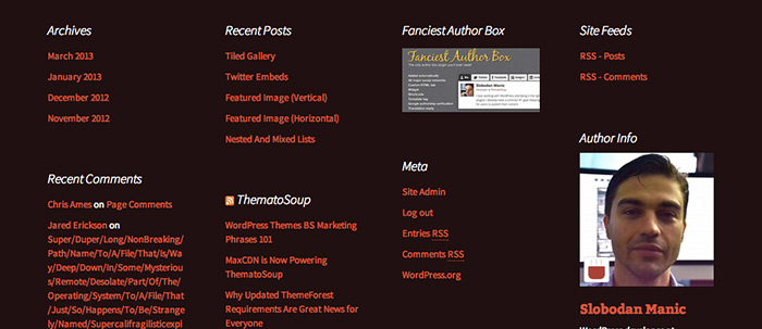
Masonry Display of Footer Widgets
Three years after its launch, I still don’t get Pinterest craze. One thing I do get is how its layout influenced web design trends. In Twenty Thirteen theme, Masonry script is used to arrange footer widgets in the same way Pinterest pins are displayed. I’m not a fan of this, in order to make proper use of Masonry, you need to have at least ten widgets, which is not likely to happen in most websites. If you’d like to disable Masonry and display widgets in a flexible grid, check out that tutorial.
Google Fonts
Typography is one thing I really love about Twenty Thirteen. With all the spacing, perhaps body font could be a bit larger, maybe 18 pixels instead of 16, but that’s easily adjustable. Source Sans Pro and Bitter are used, replacing last year’s Open Sans. If your website is in a language Source Sans Pro and Bitter don’t have support for you can disable them by translating the theme, you just need to translate ‘on’ to ‘off’ and Google Fonts are out.
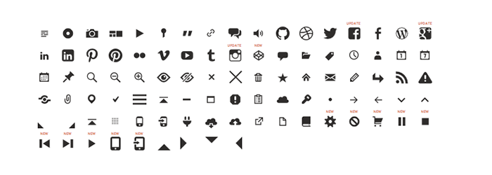
Genericons Icon Font
Genericons, a free, GPL licensed icon font is used throughout the theme, so yes, it is “retina ready”.
Single Column Layout and Content Width
As I mentioned, the theme comes with single column layout active by default, until you add some widgets to Secondary Widget Area. Content area width in Twenty Thirteen theme is 604 pixels in standard templates, 724 pixels in attachment templates and 484 pixels in audio posts.
One Menu Location
There’s only one menu location, at first that seems insufficient, but if you remember the fact that it’s possible to add menus to widget areas using Custom Menu widget you might realize that one + flexibility is just fine.
Custom Native Gallery Style
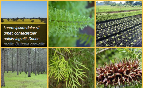
Native Galleries CSS generated by WordPress wasn’t good enough for Twenty Thirteen so it’s disabled (using ‘use_default_gallery_style’ filter). Galleries are tighter, with less space space between images and captions shown over the images on mouseover. Oh, the embedded CSS is gone as well.
Editor Style
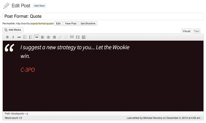
Ability to see how your posts will look while you edit them is nothing new, it was first added in WordPress 3.0, but they did take it a step further in Twenty Thirteen. You know how each post format has a unique background? Well, it’s like that in the editor as well and looks really nice. Great attention to detail.
Other Notes
Not as important as the ones already mentioned, but good to know:
- The theme requires at least WordPress 3.6, it won’t activate if you have an older version
- It is, of course, translatable
- If you’re not into oranges, there’a nine more colors to choose from, all you need to do is download Twenty Thirteen child theme Holi.
Do you use Twenty Thirteen on any of your websites? What do you think so far?



I really liked the theme and tested it out for one of the clients I work with. I was super disappointed that the header doesn’t resize for the iPad or smart phones. What an enormous oversight. I read in a forum on the WordPress.org site that others were equally as frustrated. There were some hacks provided which might fix the problem but, frankly, we shouldn’t have to do that. It’s supposed to be responsive. http://wordpress.org/support/topic/header-image-isnt-responsive
Header can be customized for logo and other changes.The background image in header should not be confused with logo and other responsive image.Look for details.
http://www.findurlaptop.com/tech/2013/08/04/customize-header-of-twenty-thirteen-theme-in-wordpress/
That’s a good point, but I’m sure a solution will appear soon enough.
Will formats also come to pages eventually?
I doubt it will ever be a core features, and rightfully so, but it’s easy enough to do it. Have you checked Post Formats Codex page?
Some great features in 2013, a growing trend I predict is people switching to 2013 and customising rather than creating a theme from scratch.
I agree. So much easier and safer to customize default WordPress templates than paying for feature-bloated themes full of bugs.
I have installed Fancier Author Box in this theme but now it’s showing two author boxes. Please tell how to remove the default one.
Hi,
Since what you’re trying to achieve is disable author box that’s added by Twenty Thirteen theme, which we only reviewed and are not authors of, it’s best that you check Twenty Thirteen theme support forum:
http://wordpress.org/support/theme/twentythirteen
I am using it on my blog here http://www.rupeebot.com/blog/ and apart from the widgets dropping into the footer everything seems fine and I am really happy with the typography
It depends in what widget area you put your widgets. You’ve got two widget areas with Twenty Thirteen, so please read the description once you click on them in Appearance > Widgets > 1. Main Widget Area or 2. Secondary Widget Area
I am having the same issue with the secondary widgets (sidebar)…It drops into the other areas (comments, and even footer) but the background color disappears. Frustrating. Also, the static front page also displays the sidebar which is annoying. I just want clean static pages and posts to appear as posts. Anyone here know how to accomplish that?
Thank you!
I believe WooSidebars may help you with the widgets. Another plugin to look for is Dynamic Widgets.
I tried to change the main navigation text color from black to white. But I could not change it.
I changed the css file several ways but no luck. How can I change the text color of main menu. Thank you in advance !!
Take a look at this video made by WooThemes – How to Change any WordPress Theme Using Firebug
Thank you so much.
It’s really helpful.
We’re using Twenty Thirteen for our site now. Im loving it! It still a work in progress.
Hello,
I have a question. I’m trying to change background for image but i don’t understand how to do it and if it is possible?
if the icones of menu i can change for the images also so i can clik to images not to simple worlds?
I’m sorry to asking probably simple questions, i’m beginner at the electonics.
Thank u and good day:)