Once you figure out what your online presence is all about, it’s time to shape your website so it reaches full potential. The best way to achieve this is to focus on the quality of your content. People want to learn about you, so let your words breath. Put blogroll on your frontage or feature a couple of your finest posts.
For visitors to recognize the value of your website, products and services, you don’t want to distract them with gimmicks, promotions or other “in-your-face” suggestions. They’ll find those subscribe forms, RSS buttons and “Try Me for Free” call-to-actions themselves, but only if they find your website worthy. And really, those are the people you want to deal with.
Everyone else will waste your time.
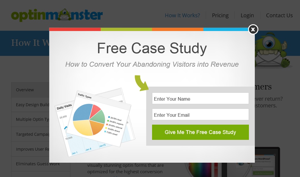
It’s amazing how many websites today use those subscribe popups which insist you pledge your email address before you even see the website. It’s like having a salesman trying to sell you goods you’ve yet to lay your eyes on. You wouldn’t see that salesman again. So, I don’t.
If a website shows me one of these:

… I’m gone for good.
I urge you not to be one of those websites.
Website Essentials
Your articles in any good, legible font, good quality (non-stock) photos and thought out navigation. That’s all one website needs for pure reading experience. If it’s perfect for reading, then it will be for you and writing. You won’t have to think about where to put your ads, how long your articles need to be for search engines, what’s this month’s proposed keyword density, etc.
A minimalist website, perfect for the readers is also perfect for the writer, making it optimized for sending your message across, which is great for selling your products and services.
If you’re a marketer or advertiser who thinks about nothing but money, this article is not for you. If you’re someone who values principles of adding value to the world, believes your product may actually make a difference and your services can be of help to people, then this is what you need to do:
Do a search for fonts, pick one, maximum two. You can learn more about fonts, their legibility and use in responsive design in the learning section of Fonts.com
Create enough spacing between your website elements. Read this timeless post on how to make clutterless websites.
Think through your navigation, so people don’t get lost. Think about site architecture, tags and categories, so you don’t get lost.
Web Elements You Need Not
The things not only people don’t like seeing, but search engines, too:
- Popups
- Zillion sharing buttons
- Sliders
- Ads
- Tracking cookies and all sorts of analytics
- In-your-face subscription fields
 Bad web design goes a long way and affects many things, not just the usability or accessibility of your website, but user behavior, reading enjoyment and fulfillment, learnability, memorability, conversion rates, etc.
Search engines have included several algorithm updates that target low value, slow-loading, ad-packed, sharing-buttoned, no-good websites. Creating online presence optimized for your readers will ensure it’s optimized for search engines, as well.
And let’s face it, Google and Bing have been trying to mimic human behavior since they were conceded. Why would you constantly monitor search algorithm trends, when they just want to become You. Just think about the things you don’t like, apply the knowledge and create a website you enjoy browsing.
There are many examples of good minimalist web design, some of which you can find in this article by Smashing Magazine.
It’s easy to get caught in things that don’t matter to you or your visitors and customers. By creating a great browsing and reading experience, you’re sending a message that you care and that your website, products or services are worthy of people’s attention.
If you want long term success, minimalist web design is the way to do it. You’ll create a bond between you and your customers. And that bond is priceless.

So let me see if I read this right … the SEO & Social Media guy just said that “Tracking cookies and analytics” are elements that you dont need then listed a bunch of metrics that require analytics to be installed?
Devon,
You’re right. Those things are needed in order to make your website more usable or see what your audience is interested in. I was just trying to point out the fact that you can do that by focusing on your content wrapped in unobtrusive interface or having/looking at your analytics, but not being obsessed with them.
It’s a very valid point you’ve made here. I may need to rephrase that part.
Thank you.
Your post is awesome, I do agree with the pop up, it’s kinda distracting and bothering; salesman.
How can we subscribe to a site while we have no idea about it’s contents.. Really!
But I must say I have a slider because almost all sites on my niche have it, then I follow them. I don’t know, sounds silly?
Still have lot to do to my new site though, with my new experience :D
Desiana,
Thanks for your comment. Yes, sliders are still being overused. You can check these two posts to learn more about their effectiveness and their alternatives:
1. https://yoast.com/opinion-on-sliders/
2. https://managewp.com/slider-alternatives/
Inspiring to read articles such as this. Both interesting & comprehensive. Thanks!
Thanks Steve.
I must thank you for the efforts you have put
in writing this blog. I really hope to check out the same
high-grade content from you later on as well. In truth, your creative writing abilities has motivated me to get my very own blog
now ;)
Great, cheers.
Interesting read, although most of these ideas should be applied in all designs, not just minimalist ones, alignment is especially important in every design, if this is missed out designs will just look messy and that not enough thought has been put into the design.
Thanks for stopping by, Joseph. Nice observation. Yes, designing properly requires a lot of thinking before actually producing stuff, but in the digital world where everything is so accessible, people tend to forget.