You might like them or not, but you should definitely test your website and see whether sticky (fixed) headers are something that make your visitors want to stay longer and browse more of your content.
Better User Experience
Having a sticky header on your website will enable people spend less time scrolling and searching, allowing them to find the information they need with minimal effort.
Using a fixed header makes users feel in control throughout the browsing process of your website. This is extremely important for overall user experience. No one wants to feel like they’re wasting time or can’t quickly and efficiently navigate. As a result of moje enjoyable experience, you’ll gain more returning visitors and more customers.
The better user experience you provide through your website, the more likely it is that users will recommend it to other people. Search engines also value user experience as an important part of their search ranking criteria, so having a sticky header could make a big difference in terms of SEO.
Easier Navigation
Using a sticky header reduces the time needed for your audience to navigate around and read more of your website. It reduces the amount of scrolling and gives people a simple and always-visible navigation. Sometimes on smaller screens a sticky header takes up space, which can be frustrating for your readers and that’s why it’s good to be able to hide your header in those cases.
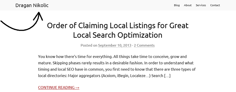
It’s become the most common thing to have a sticky header slide in as you begin to scroll down and your original header reappear as you navigate back to the top of your website. This way your branding and your navigation is always visible.
Navigation is one of the most critical elements. It should be easy to access and reach the information visitors need in as little time as possible. If your website navigation is too complicated, users will simply click off and look for the information they need elsewhere.
Better Branding
The more people see your logo, the more likely they are to remember and recognize it in the future, so make it visible at all times.
Your logo is something you want people to subconsciously keep in mind while browsing.
Sticky headers provide advantages like quick and easy navigation, but they also have brand building benefits. A website’s header will usually include your brand name and logo, so if you were to fix the header to the top of the screen, this would keep the branding of your website at the front and center of your users’ attention at all times. The more users see your branding (whether they are consciously looking at it or not) the more likely they are to remember it and recognize it in the future.
Plugins
To pull this off, you can either hard-code your fixed header using many of the tutorials found on the web or you can use the following WordPress plugins, coded with best practices in mind.
1. Sticky Header by ThematoSoup

You can tweak it from within your theme’s customizer. You need to create at least one navigation menu before you can add it to Sticky Header. The menu in Sticky Header shows only first level items, so no submenu items.
You are free to upload your custom sticky header logo. Ideally, this logo should be 30px tall or it will be resized to this height. If you don’t upload a logo image, then your site title will be used.
You can choose the background and text color and make it match your website, the font family will be inherited from your website. Also, there’s an option to hide your WordPress header if a visitor uses a mobile device, so no screen real-estate is wasted.
Download our Sticky Header plugin from the WordPress.org repository.
2. Awesome Header

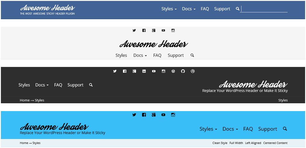
Awesome Header is a premium WordPress plugin that automatically becomes your sticky header upon activation or it can completely replace your WordPress header section.
It enables you to have up to 3 layers of navigation in your header:
- Top (social icons, WooCommerce menu)
- Main (branding, main navigation)
- Bottom (Breadcrumbs, submenus or page titles)
Another good implementation of Awesome Header is header area that shrinks in height to accommodate more screen real estate as you make your way down the page. It also supports submenus, up to 3 levels deep.
Its purpose is to make your website more useful, user friendly and to improve the general look and feel, even on narrow screens. If you enable Breadcrumb functionality (WooCommerce & bbPress Breadcrumb support), your website will have rich snippets in search engine result pages and that improves click-through-rates.

It uses Genericons, font icons so your social buttons look great even on retina screens. The benefits of having Awesome Header as your WordPress header are many:
- Better branding
- Better usability
- 100% responsive
- Better Click-Through rate with Breadcrumb Microdata
- More page views per visit because of ever-visible navigation
- Lower bounce rate because of better UX
With Awesome Header you can set your own color schemes and make it match your website look and feel, so everything blends in nicely. You can also create many different looks, depending on how many menus you enable, how you position them (left, center or right) or by using many of the Awesome Header filter hooks and actions (if you’re a developer).
You can download Awesome Header via CodeCanyon. Considering your header section is the most important one, the control you get by replacing and testing different navigation and branding configurations should be well worth it.
You never want your header to take up the whole screen, so make it as light and slim as possible. Try different layouts and see which one performs best.
Fixed headers are becoming increasingly popular, because they add value in terms of both usability and aesthetics. They help improve user experience of your website, but they also enable you to keep your branding always visible, subconsciously putting a signature to your content.
Try them and tell me what you think.

Why is there no demo? Never buy any plugin or theme without a live demo…
Hi, that’s a fair point. Sticky Header is a free plugin available at WordPress.org plugin repository https://wordpress.org/plugins/sticky-header/ so you can easily install it and see if it’s good for your needs. Awesome Header has a live demo at http://awesomeheader.com so you can see it in action.
Hi, love this plug in. The only issue I have is when in mobile mode it doesn’t go right to the top, therefore can see the page scrolling behind it. Can you help please?
Hi,
What’s your URL?