You take several ribs, maybe a chicken, some potatoes, a piece of pumpkin, add a couple of exotic spices and you have it – a delicious dish called Cazuela. Now, if this is not the recipe you have hoped for, let me give you a different one, for a premium WordPress theme this time:
- WordPress best practices throughout
- Flexibility
- 5 different template flavors
- Beautiful fonts
- 11 color schemes
- 9 widget areas for you to throw in some of your stuff, like banners, ads, calls to action, AdSense
- Responsiveness, so it looks good no matter the lens size
- Retina ready, so it looks sharp no matter the dioptry
- Translation ready
And yes, it’s free as it gets. If you’d like to try it now, you can head over to Theme Cazuela page, but if you’re still far from being persuaded to try something different, let me have another go.
WordPress Best Practices
Best practices are what every WordPress product should embrace, especially those on ThemeForest. It would make life so much easier for all developers and users. It is something we’re passionate about and you can read all about it on our philosophy page.
Regarding the Cazuela theme, WordPress best practices make it:
- Extremly flexible
- Gentle on your content (since theme’s in charge of your website visuals only)
- SEO friendly
- Fast
- Extensible
- Secure
- Compatible with the likes of other WordPress plugins also made in accordance with WordPress.org codex
- Compatible with future WordPress releases
If you haven’t skipped reading what best practices mean for a WordPress product, I’m sure it’ll become the main feature you’ll look for in your future purchases.
Moving on to Theme Customizer, something that should replace all those nasty looking theme options panels.
Theme Customizer
Theme Cazuela utilizes native Theme Customizer and not custom theme options panel that you find in so many premium WordPress themes today.
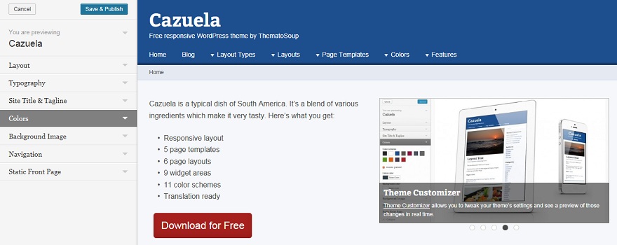
Theme Customizer allows you to tweak your theme’s settings and see a preview of those changes in real time. It’s been introduced in WordPress version 3.4, so make sure your WordPress installation is compatible with Cazuela, before activating the theme.
Responsive & Retina Ready
It’s become a standard feature in all premium WordPress themes and it’s an SEO friendly solution – responsive layout means you don’t have two of the same websites (standard and mobile) for different screen sizes and it is what search engines like these days.
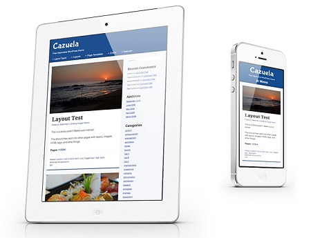
In addition to being responsive, Cazuela WordPress theme is also retina ready, which means it’ll look sharp in any screen resolution.
Widget Areas
9 widget areas Cazuela offers, give you the control you need to insert content and widgets where ever you need them.
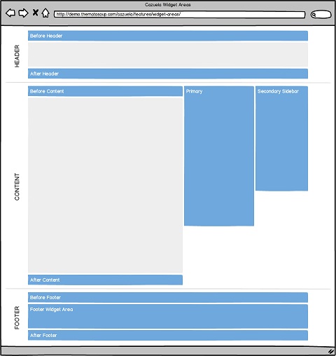
There are 3 main widget areas:
- Primary Sidebar
- Secondary Sidebar
- Footer Widget Area
Most people will use these three, but some will have the need for inserting banners, AdSense ads, calls-to-action and other content and have more control over positioning.
In addition to this you control 6 more widget areas:
- Before Header
- After header
- Before Content
- After Content
- Before Footer
- After Footer
And that’s not all. Cazuela has one Homepage widget area below all your content where you can insert three widgets per row in an unlimited number of rows. This widget area is used in Widgetized Homepage template.
Other Features
You’ve seen just a glimpse of our free, premium WordPress theme, but the post is getting long, so I’ll try to squeeze in the rest.
Page layouts
You have an option of 2 layout types:
- Boxed
- Full width
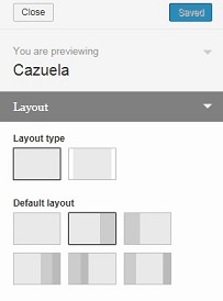
And 6 different page layouts:
- One column layout
- Two column layout – right sidebar
- Two column layout – left sidebar
- Three column layout – 2 right sidebars
- Three column layout – 2 left sidebars
- Three column layout – left primary sidebar, right secondary sidebar
Each one can be set site-wide, in Theme Customizer, or for individual posts or pages.
Masonry page template
We know Pinterest has become huge in the last couple of years, so we created masonry (Pinterest-like) page template, which can be a nice, refreshing way of presenting your posts.
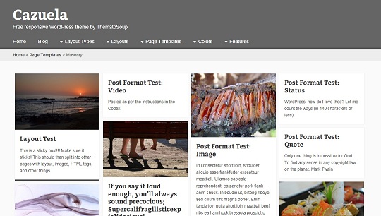
It stacks your content in a dynamic layout grid. You can choose categories which to include and the number of posts per page in the Options custom field.
Authors template
For all of you who have active blogs and lots of blog contributors, you’ll find authors template useful. Authors template allows you to show a sortable list of subscribers, contributors, authors, editors and administrators.
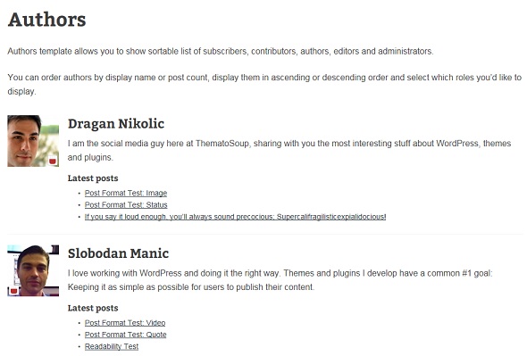
You can order authors by display name or post count, display them in ascending or descending order and select which roles you’d like to display.
Theme hooks
Something developers will appreciate. Cazuela enables you, using theme hooks, to easily create child themes, customize and further extend the functionality of the theme.
Cazuela theme is a very versatile WordPress product that can easily and quickly be turned into something your online business needs. With so many different color schemes, page templates, layouts and other premium stuff, it’s not that difficult to customize it to your liking.
We intend to add more features and page templates in the future, so be sure to subscribe to our mailing list.
If you have an idea or two on how to improve it, don’t hesitate to use the comments section below.

First and foremost, this theme is a beast. I still can believe the number of widget areas and the amazing default layouts. An option to get some of that header real estate back would be great (wordmark, nav and maybe search on the same line). How about a sidebar option to the masonry page?
Cheers!
Thanks!
You mean a more compact header, right? We’ll discuss that one internally.
Wouldn’t a sidebar make Masonry page too narrow? I tried it with a sidebar, it looked odd at the time, but no reason not to introduce an option for it and allow users to choose from full-width page or one with a sidebar. Thanks for suggesting this.
Thank you for considering my suggestions…yes, you’re exactly right, a more compact header, sort of like what you have on this very page. As for the sidebar on the masonry page, I was definitely thinking of a full browser width scenario, else I agree, it would look odd.
Thanks again for the great theme.
I agree, a compact header with a option for be fixed would be a great improvement.
Thanks for this poweful theme.
We’ll plan it for one of the next iterations.
Thanks for your input.
This is exactly what I’ve been looking for! Was almost ready to throw out WordPress altogether and build html sites. Thank you very much for making this theme available and for having the philosophy you have.
Thanks. I’m glad we weren’t late with publishing Cazuela.
Dragan, is there any way to use my existing header on this theme? It’s just that these colors have been with me for over a decade and traders have come to associate them with my site. You can see it here on the disclaimer page: http://www.supportandresistance.com/risk.html Other than that, this theme is perfect, I love it.
Thanks. I think you can upload your custom header image in Appearance > Header.
My header is a transparent image on top of a background image. I guess upload the header in the header panel…does Cazuela allow a custom background image along the top only? Sorry for the dumb questions, I’m not very knowledgeable about building websites! I really do appreciate the help.
First of all: I like Cazuela very much. So much that I immediately downloaded the theme and started to play around with it.
I am trying to make it work but as I am fairly new to wordpress I haven’t succeed making flexslider work. Do you have any tutorials on just how to do that and other stuff that may be challenging for a newbie?
Hi and thanks for your kind words.
To make slider work you need to use proper page template (Homepage with Slider). Then, any images you attach to the page will be added to slider. No need to insert them into the page itself, you just need to upload them using Add Media button while you’re editing the page.
Hi! Is it possible to align the slider not only to the right, but in the center, and to the left? Thank you
Hi,
To align slider to the left:
#homepage-aside { float: left; }
.page-template-page-templatestemplate-homepage-php .hentry #homepage-aside + .entry-content { margin: 0 0 0 50%; padding: 0 0 0 30px; }
To make it central:
#homepage-aside { float: none; width: 100%; }
.page-template-page-templatestemplate-homepage-php .hentry #homepage-aside + .entry-content { margin: 0; padding: 30px 0 0; }
All this added to style.css file.
Thanks a lot!
Hi
Is there a way to make the page Title smaller?
Thank You.
Making the Home, About, Photo Gallery page title smaller when they get to that page.
Yes, you could add some custom CSS and make titles smaller.
.page .entry-title { font-size: YOUR-FONT-SIZE; }Would resize page titles.
Awesome!!! Worked like a Charm.
Love your theme. Thank You so much Slobodan!!!
Thank you, glad I could help :)
Morning.
Is there a way to make the post, page a different color? Not the background color change but the post or page that sits above the background. I can’t seem to find this information anywhere.
Thank You,
Marvin
Marvin, sorry for the late reply. It’s
.hentry { background: "color you want"!important;}I have problem with using the slider. Image in the slider becomes blurred. The example in the picture on the link – http://alona.com.ua/sample.jpg. At the top is the original image, at the bottom – a screenshot of the slider. I use image as is, no crop , no resize or scale. Could this be the problem of the slider or something I’m doing wrong?
1. When you say slider, are you using a) slider plugin or are you using b) Cazuela’s “homepage with slider” template?
2. Cazuela is using native WordPress functions, so when it comes to cropping images it’s all WordPress and not the theme. Is size of your image smaller than the area it needs to fill, so WordPress resizes it?
I use “homepage with slider” template. Size of image is exacly fit the area. I try some other images – result is the same – blurred image. When i add image to page with default template or to the post – there is no problem.
I anderstand. Slider make image smaller automatically . in my CSS file i set –
#homepage-aside {
width:100%;
}.
It makes picture bigger again, but quality lost. How can i improve that?
I was wondering, how do you change the background color of the navigational menu that appears under the header? I thought it was .main-navigation, but that doesn’t stretch all the way across the screen (it’s padded). I tried adding a different background image in .scheme-blue.header-gradient #masthead which worked in all browsers except internet explorer. Any suggestions for this newbie? Thanks.
As usual, once I post a question publicly, I stumble upon the answer myself:
.main-navigation {
margin-left: -20px;
margin-right: -20px;
padding-left: 20px;
background: #909092; /* Show a solid color for older browsers */
background: -moz-linear-gradient(#909092, #707070);
background: -o-linear-gradient(#909092, #707070);
background: -webkit-gradient(linear, 0% 0%, 0% 100%, from(#909092), to(#707070)); /* Older webkit syntax */
background: -webkit-linear-gradient(#909092, #707070);
}
Wow, glad you got it to work and thanks for posting the solution.
Hi guys, I use ‘post categories’ to group related posts together and I was wondering if there’s a way to display only portions of each post on the category pages (featured images and titles only would best, but a snippet of the content could be ok too..) as opposed to the default behavior of displaying posts in their entirety.
And just a thought…it would be fun to see how people are customizing Cazuela…maybe you can get a gallery started.
Cheers,
-J
Thanks for the recommendation J. We may create a showcase of Cazuela websites some time in the future.
As for displaying only excerpts of posts, could you go through this thread – http://wordpress.org/support/topic/edit-homepage-content-to-excerpt?replies=12
I believe it may help you solve your issue.
Thanks for you reply and assistance, Dragan.
Thanks for your wonderful theme, it’s very complete! One question:
how do I change the layout to 1 column so the sidebar isn’t shown anymore? I tried to do this in the theme customizer under Layout, but I can’t change it there. Thanks for your help!
Thanks for using Cazuela.
Theme customizer changes the default layout of your website. On every post and page, you can find “Layout” meta box below the post/page editor, where you can set this option per page/post.
If you don’t see it, you need to enable it in “Screen Options” in the upper right corner.
Thanks for your quick reply. I do see the option in the page editor but like in the theme customizer I’m not able to change it. When I put my indicicator on it the Arrow changes into a hand, telling me I can select this option, but once I click it nothing happens…
You’re right. I’ll assign this issue to our developer and ping you once it’s fixed.
Thanks for reporting it.
Dragan, I just like your name.
Anyway, I want to give this theme a try- stuck in a theme that isn’t working for me.
Thanks,
You can also try some of our other themes https://thematosoup.com/themes/
Hello Its 2017 and I am Still Using This Theme, I love this Wp template But its Not update From last 3 year Please update it for latest WordPress Standerd waiting For Your reply.
Unfortunately, Rahul, we won’t update the theme anytime soon, but it’s been coded with WordPress best practices and is future proof, so you shouldn’t have any issues using it.
Hi,,
Grate Theme .First of all: I like Cazuela very much. So much that I immediately downloaded the theme and started to play around with it.
I am trying to make it work but as I am fairly new to wordpress I haven’t succeed making flexslider work. Do you have any tutorials on just how to do that and other stuff that may be challenging for a newbie?
Thanks for your kind words, Anil.
Unfortunately, the theme is not made with FlexSlider in mind and I’ve never worked with the plugin, so I wouldn’t be able to help you.
Why the theme is not updated from a long time. Please update it so that we can continue to use this theme.
Sorry about that, but we’ve decided to spend our time and resources on different projects.
Cazuela was a cool theme, Dragan! We used it on some of our projects wayyy back. Sorry to see it fall away, but wish you all success on your future endeavors :)
Thanks, Rich. Yeah, it’s sad to see some cool things like Cazuela fade away, but what can you do.
Thanks for stopping by and all the best to you.